
How often do users abandon a website because it feels slow, cluttered, or difficult to navigate on their phones?
With more than 64% of global web traffic coming from mobile devices in 2025, it’s clear that prioritising mobile users is crucial because most people access websites on their phones first.
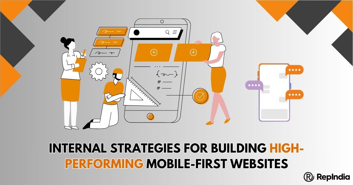
At RepIndia, we design websites with mobile users in mind from the very beginning. Integrating mobile-first design principles and AI-first design innovations ensures every project is easy to use, fast, and intuitive, making us one of the best web design companies in India.
Mobile-first strategies guide how users interact with content, how quickly they take action, and how often they return.
A website designed for mobile first focuses on what users need most, ensuring a smooth experience that improves engagement and business outcomes. Let’s learn about mobile-first design.
Mobile-first design is a method of designing websites starting with the smallest screen, such as a smartphone, and then expanding the design to tablets and desktops.
The idea is simple: people use mobile devices more than any other device, so the website should be optimised for mobile users first, rather than shrinking a desktop website to fit a phone screen.
Example: Imagine visiting an online store on your phone. If the “Buy Now” button is hidden or the page takes too long to load, you leave.
A mobile-first design ensures this button is visible immediately, the page loads quickly, and images or forms automatically adjust to your screen.
An AI-first design is the use of artificial intelligence to automatically improve website layouts and content based on user behaviour.
It predicts what users want to see and adjusts the website to show them the most relevant content first.
Example: On a news website, an AI-first design might highlight trending articles or reorder sections based on what users read most, giving them a personalised experience without manual intervention.
Only essential content appears on mobile screens. Buttons, forms, and visuals are positioned so users find key information immediately. Primary actions like “Sign Up” or “Buy Now” are placed above the fold, reducing scrolling and increasing engagement.
Fast websites retain users. Images are compressed, scripts are optimised, and caching is used to improve load times. For users in areas with slow networks, performance optimisation ensures a smooth experience.
While mobile-first design starts with phones, layouts expand naturally to tablets and desktops. Flexible grids, media queries, and scalable layouts maintain a consistent design and user experience across all devices.
AI-first design predicts user needs and personalises content. For example, a travel website might show popular destinations to first-time users and highlight special deals to returning users. Combining AI insights with mobile-first layouts ensures that websites are both intuitive and engaging.
Websites are tested on multiple devices and network speeds to ensure consistency. Buttons, forms, and menus are checked for accessibility, ensuring smooth navigation for everyone.
Feedback loops from designers, developers, QA specialists, and clients help refine usability, layout, and performance before launch. Continuous improvement ensures the website remains mobile-optimised and user-friendly.
Clients seek the best web design company in India capable of delivering high-performing mobile-first websites. Following these strategies improves engagement, conversions, and brand perception.
Mobile-first and AI-first websites allow brands to make data-driven adjustments quickly, improving ROI. They load fast, adapt to all devices, and show users the content they need most, giving clients a competitive advantage.
Workflows are continuously updated with new tools, frameworks, and AI-first practices. This helps us create websites that are not only modern but also intelligent, responsive, and highly user-focused.
Prioritising speed, usability, and modern design principles ensures websites resonate with users in 2025 and beyond.
These strategies enable us at RepIndia to remain a trusted website designing company in Delhi and consistently deliver impactful, user-focused websites.
Structured planning, AI-driven insights, and mobile-first approaches ensure that every project sets a benchmark for engagement, usability, and mobile-first excellence.
Write a Message
