A good landing page should convert. That is its only job.
But despite having all the right ingredients—attractive visuals, compelling copy, and a solid offer—many landing pages still fall short. The reasons often lie in small but costly oversights. For businesses, especially in a competitive digital space, these missteps can mean losing out on valuable leads.
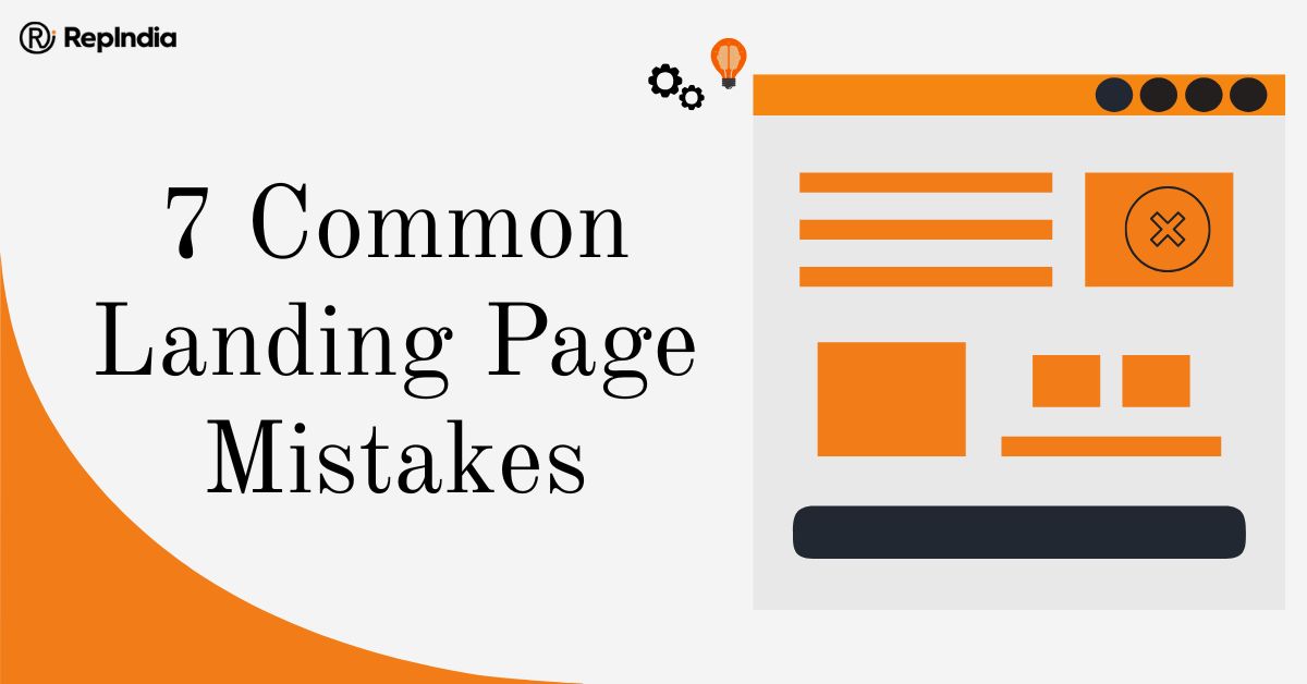
From our experience working with brands across industries, we at RepIndia have observed recurring errors that silently damage conversion rates. This blog highlights seven common landing page mistakes and how avoiding them can drastically improve your website’s landing page optimisation efforts.
Speed is one of the first impressions your landing page makes. If it loads slowly, the user leaves—no matter how brilliant your offer is.
This is not just anecdotal. Page speed is a known factor in both user experience and search rankings. In the startup and SME ecosystem, where businesses often rely on paid campaigns to drive traffic, a delay of even a second can waste precious marketing budget.
Landing page optimisation starts with performance. Compress images, reduce unnecessary scripts, and use reliable hosting. A fast-loading page is no longer a bonus but rather expected.
Many landing pages assume visitors will know what to do next. That is rarely the case.
A strong CTA tells the user exactly what is expected of them. ‘Sign up’, ‘Download now’, ‘Get your quote’—it should be clear, specific, and impossible to miss. A weak or buried CTA leads to friction and drop-offs.
One CTA per page is often enough. Too many choices overwhelm users. Simplicity converts.
In a city like Bangalore for instance, where mobile usage dominates internet access, a non-responsive landing page is a guaranteed conversion killer.
Users scroll fast. They tap, swipe, and expect content to adapt instantly. Fonts should be readable, buttons should be tappable, and forms should work seamlessly across devices. A website’s landing page optimisation without mobile responsiveness is incomplete.
It is surprising how many brands still overlook this, despite clear user trends.
Read more: Reducing Decision Fatigue: Simplifying User Choices in Website Navigation
Balance matters. Overloading a landing page with text overwhelms users, but saying too little leaves them confused.
The copy should address key questions: What is being offered? Why should the visitor care? What happens next? These must be answered quickly and clearly.
Businesses often target tech-savvy audiences who expect clarity without fluff. Keep messaging sharp, benefits-focused, and structured. Use subheadings to break down sections. Guide the reader, do not drown them.
Would you hand over your email address or payment details to a company you do not know?
Without testimonials, client logos, case studies, or even simple badges (like secure checkout or “used by 10,000+”), visitors hesitate. Trust needs to be earned, especially in industries like fintech, education, or real estate.
Authentic social proof is a core part of landing page optimisation. It turns interest into action.
Design is not just aesthetics but also function. A cluttered or generic layout distracts from your CTA. Poor contrast makes buttons hard to see. Stock photos feel impersonal.
Design should guide the user’s eye to where it needs to go. For example, many brands benefit from simplifying their layouts—white space, hierarchy, and consistent colours go a long way.
Every design element should serve a purpose. If it doesn’t, it should go.
A landing page is never ‘done.’ It evolves.
Yet many brands launch and leave, without any heatmaps, A/B tests, or performance tracking. This means they miss opportunities to improve conversions over time.
A solid landing page optimisation checklist includes regular performance reviews—bounce rate, scroll depth, form drop-offs, and more. Data tells you what to change. Without it, you are guessing.
We at RepIndia, as a website development agency in India with a strong focus on measurable results, integrate these analytics tools from day one. This ensures every landing page is not just built—but built to perform.
Landing pages are where attention becomes action. At RepIndia, we approach them with that exact mindset.
Our teams in Bangalore and beyond work closely with brands to ensure their landing pages are not just good-looking pages but conversion-focused assets.
From structuring the layout and crafting focused copy to running A/B tests and aligning it all with a clear landing page optimisation checklist, we look at every detail.
It is not about adding more. It is about removing what does not work.
For brands looking for reliable web development services in Bangalore or a seasoned website development agency in India, RepIndia brings a blend of creative thinking and performance-led execution.
Every landing page we create is designed to meet specific business goals, whether that is lead generation, product sales, or sign-ups.
Your landing page is not the start of your funnel. It is the most important point in it.
All your digital marketing efforts—ads, social, email—lead users here. If this page fails, everything upstream becomes less effective.
Avoiding these seven common mistakes can dramatically improve your conversion rates. Focus on clarity, speed, mobile responsiveness, and trust. Track performance and keep refining. That is what landing page optimisation is all about.
And if it feels overwhelming to handle it all internally, it might be worth speaking to experts who do this every day.
RepIndia is here to help you get it right.
Write a Message